The future of browsing: private, productive, yours. A new Mozilla browser
April, 2025 | School Project - University of Waterloo
Project Type: Group
Role: analyzed user research, developed prototypes, analyzing user tests
Our new Mozilla browser is an all-in-one hub for Gen Z– empowering users to browse faster, stay organized, customize their experience, and take control of their privacy, all in one place.
Project Brief
Mozilla approached us with an initial design prompt, which our team had the opportunity to explore during a focused two-week sprint.
Design prompt:The way we browse the web hasn’t changed much in decades: users navigate between multiple tabs, search for information, and consume content in fragmented ways. With the rise of AI, multimodal interfaces, and privacy concerns there is an opportunity to rethink how we interact with the internet. How can we make browsing more intuitive, distraction-free and personalized while respecting user agency and privacy?
HMW:Design the next evolution of web browsing that enhances productivity, discovery, and user control?
Software Used
Figma
Miro
Zoom
Microsoft Teams
Research and Discovery
Competitive Analysis
Starting this project, we analyzed 5 existing browsers to understand the competitive landscape. Our research revealed that most competitors struggled with privacy concerns, cluttered interfaces and limited support for focused, productive browsing. However, many leading browsers already benefit from established user bases and deep integration within their ecosystems (cross-platform experiences). Most competitors have also begun exploring AI enhancements. Other competitors also have the advantage of coming pre-installed on devices, giving them an automatic distribution advantage. Our goal for this research was to identify possible opportunities to differentiate ourselves within this market and to identify areas of improvement.
The sites we analyzed include Safari, Google Chrome, Microsoft Edge, Brave and DuckDuckGo.
Safari
Advantage: Strong privacy stance (anti-tracking tech), Deep integration with macOS and Ios
Disadvantage: Limited to Apple Ecosystem, less customizable, occasionally slow to adapt new web standards
Google Chrome
Advantage: Massive user base, web compatibility, integration with Google Ecosystem, strong developer tools and frequent updates
Disadvantage: Privacy concersn (tracks user data for ads), less innovation in privacy first features
Microsoft Edge
Advantage: pre-installed on windows devices, innovative features (vertical tabs, tab sleeping), syncs well with Microsoft 265 tools
Disadvantage: Poor brand loyalty, concerns over data collection practices/privacy
Brave
Advantage: Strong privacy first messaging, built-in ad and tracker blocking
Disadvantage: Not very popular, Crypto integration
DuckDuckGo
Advantage: Strong privacy focused brand identity, no tracking policy, integration of browser protection (also search engine and email)
Disadvantage: Limited featues compared to mainstream browsers, user interface is less polished, reliane on Bing for search results backend
We also Developed a SWOT Analysis for Mozilla's FireFox to better understand its current positiioning in the market.
Mozilla FireFox
Strengths: Non-profit company with open-source transparency, strong privacy tools (enhanced tracking protection), broad platform support, indepenent from "Big Tech"
Weaknesses:Slower performance compaired to some competitiors, limited ecosystem integration, slower to integrate AI-powered features, Heavily funded by Google Search
Opportunities: Lead in digital privacy advocacy, expand privacy services, growing depand for ethical AI integration
Threats: Growing dominance of Chromium, limited visibility on mobile devices, tech giants are copying privacy features quicker and better
Secondary Research
Our target audience for this project consisted of students aged 18-28 – a group heavily relying on browsers for studying, research and daily productivity. As part of our secondary research, we analyzed Reddit discussions to gain insights into user frustrations, needs, feature requests, and browsing habits. Specifically, we looked to forums such as colleges/, and universities/ to ensure we were finding results from our desired target group. These forums offered valuable information that helped us to develop our user persona.
Key Insights
Through this research, we uncovered several critical patterns in the behaviours and attitudes of our target users. These insights shaped our approach to both design and feature prioritization:
Our research revealed that privacy is a non-negotiable priority for Gen Z users, who view it as a fundamental expectation rather than a premium feature. Many expressed distrust towards mainstream browsers like Google Chrome due to questionable data practices and lack of transparency. These users actively seek tools that align with their values around digital autonomy.
Usability also emerged as a key driver of engagement. This generation is more likely to abandon products that feel unintuitive or bloated, revealing an opportunity to design a clear browser that features a minimal interface and an abundance of customization options.
Performance was also a common theme, as users often critique a browser based on its speed. And finally, while Chromium powers most modern browsers, it isn’t universally preferred. As Mozilla is one of the few companies that does not rely on Chromium for its browser development, it sets them apart from the competition.
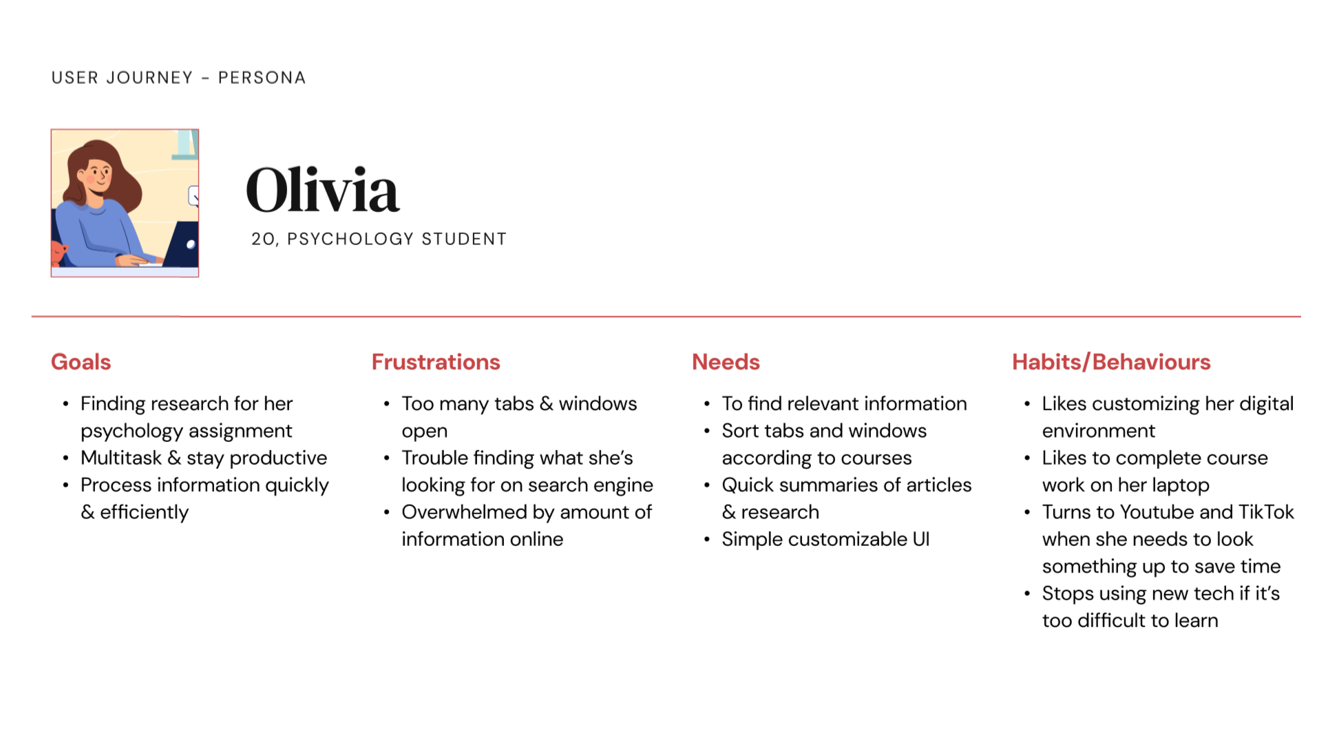
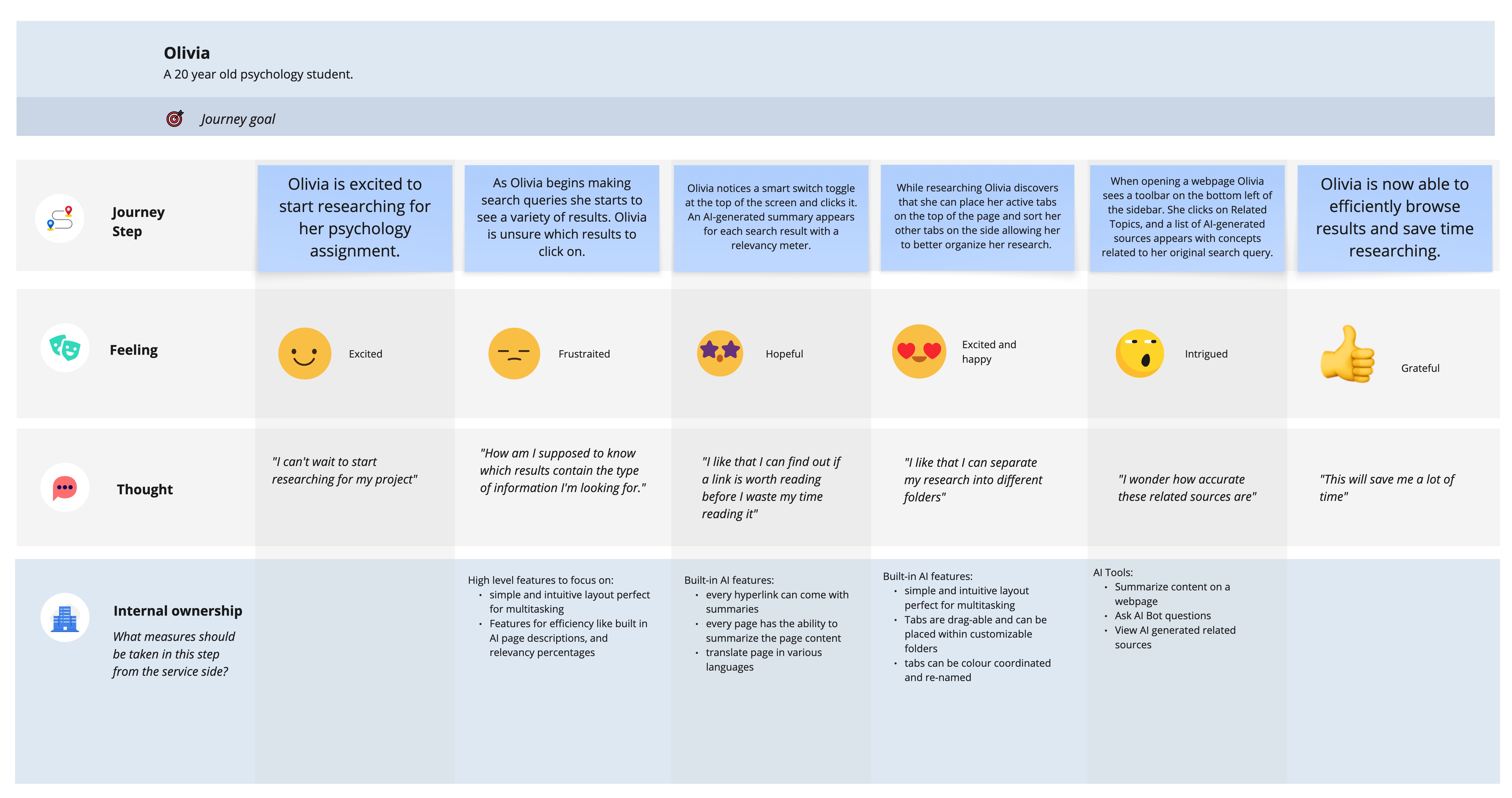
Personas and Journey Maps
With the help of an affinity map to organize the insights gathered during our secondary research, we crafted a distinct persona and correlated journey map. These essential artifacts served as contestant touchstones throughout the project, guiding us in maintaining a clear focus on the intended users for our design.
Fig.1 Olivia PersonaFig.2 Journey map
Problem Definition
Gen Z have expressed their frustration with browsers compromising their privacy, being bloated with unnecessary features and lacking meaningful customization options. Most browser options fail to offer a transparent, privacy-first experience without sacrificing speed or usability. As a digitally influenced generation, Gen Z demands intuitive, fast, and adaptable tools that reflect their values and habits. This highlights the need for a browser that puts user privacy first, enhances productivity, supports new content discovery and offers flexible personalization. Gen Z users are increasingly turning away from traditional browsers. Their shift toward platforms like TikTok as a search engine replacement also reflects a desire for quick, digestible content over conventional search experiences.
Design Process
Design Goals
Our design is grounded in the initial vision to reimagine the browser experience for Gen Z users. Specifically, this design leverages emerging AI tools and rethinks conventional tab interactions to offer a more efficient and personalized browsing environment. Central to our approach is the principle of user autonomy, ensuring individuals maintain full control over their privacy settings. Our overarching design goals serve as a continual reminder of the values and outcomes we aim to achieve through this solution.
Streamline resource management through flexible tab organization
We aim to introduce a customizable tab management system that reduces clutter and enhances productivity.
This feature allows users to organize tabs into folders, drag content directly into a sidebar for easy access, and hide the interface when focus is needed
Provide tutorials to ensure knew users will get the most out of our browser’s available features
Tutorial prompts will assist first-time users, ensuring an intuitive experience from the start
Enhance information retrieval and comprehension through AI-powered search and tools
Our browser introduces an AI-enhanced search and summarization system that streamlines how users find and engage with information
Users are presented with smart cards each featuring a clean AI generated summary and visual preview of the content- these cards will only provide users with relevant information to help them decide if the site is worth exploring
Upon selecting a result users can access our text, audio or video summaries
Our AI tools will offer quick Q&A functionality and surface related topics enabling further exploration with minimal effort
Create seamless and flexible onboarding experience
Through our onboarding process we plan guide users through essential configuration of their browser in as few steps as possible
Users can set up their privacy, themes, language, and get suggested extensions from the get-go
We want to ensure transparency and user control remain core to the experience
Prototyping and Testing
Testing Methods
For this project, 2 phases of tests were conducted with our target user group (Gen Z 18-28). I was responsible for analyzing and developing possible refinements. Most of these tests were conducted over Microsoft Teams. In our first round of usability testing, we conducted an exploratory test where our facilitator would share their screen and walk through the initial prototype with our participants. Our second usability test was task/scenario-based. During this session, the participant would share their screen and interact with the prototype themselves.
During this process, the think-aloud protocol was our primary method of gathering information from our participants, as it was important to hear their thought processes when navigating our solution. During each session, a designated note-taker recorded observations, and each session was recorded and further analyzed to uncover insights about our design. By converting the raw data into meaningful information, we could establish user mental models and modify the prototype appropriately.
Goals for Usability Test
Usability: users experience 2 or fewer errors while completing tasks
Learnability: do the users understand how to navigate the system
Task completion: can users complete the tasks
Usability Tasks
During our second usability test, we composed 5 different tasks for users to complete for our usability test. These tasks focused on our smart search, AI tools, onboarding and flexible tabs. The success of each task was broken down into 3 evaluation categories. Pass, indirect, and fail. Through this evaluation, we determined the viability of our current design. Upon completing our tasks, participants would be asked pre-determined follow-up questions. Each identified usability issue was then evaluated based on its severity (the level of disruption to the completion of the task) and the frequency of the error (the total number of times the error occurred during this phase).
Participants
For our initial usability test, we comprised a group of 5 individuals. For our second phase of testing, we comprised a group of 3 new participants. All of these users were in our target user group.
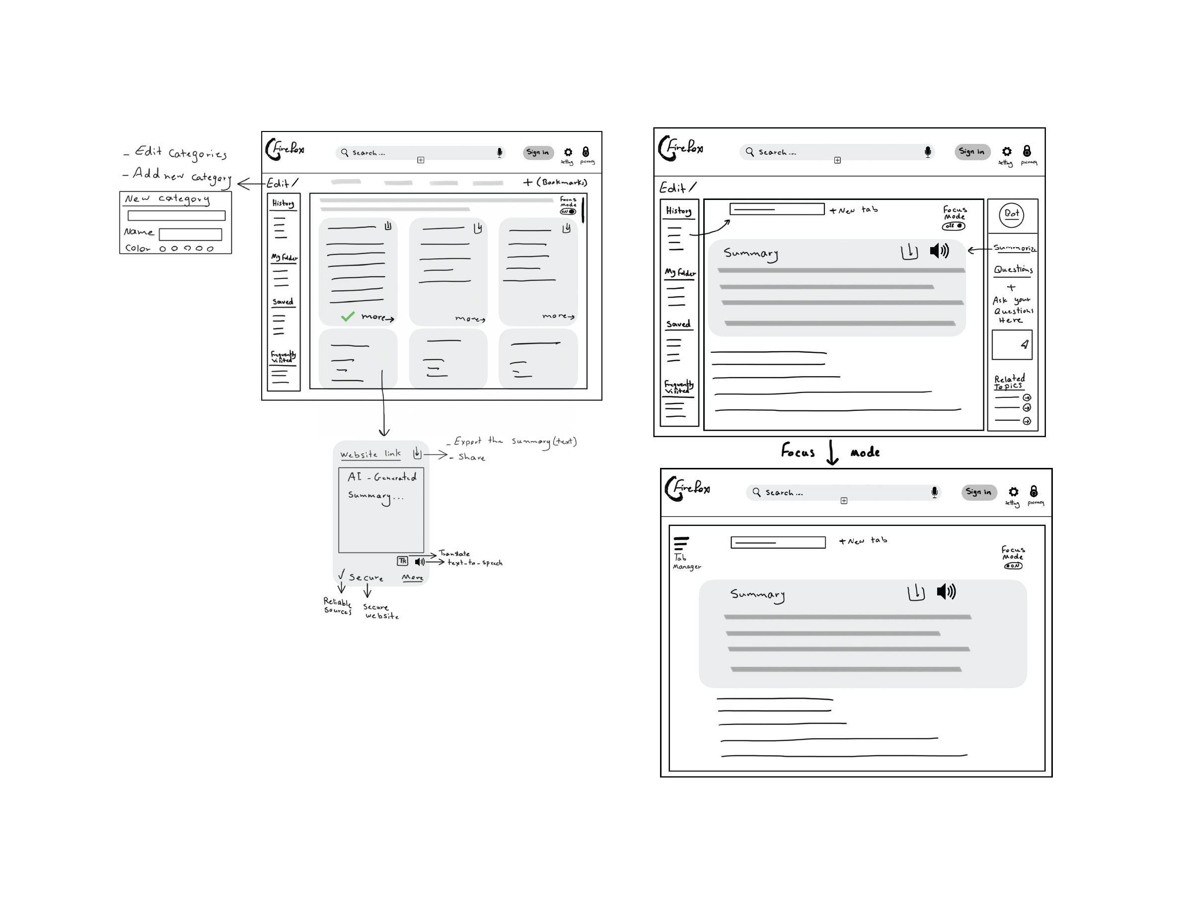
Low-fi Prototype
No tests were conducted on the initial sketches of our prototype. These were used to help develop the initial version of our solution on Figma.
Fig.3 Low-fi prototype
Mid-fi Prototype
During our initial phase of testing on our mid-fidelity prototype, we performed an exploratory usability test. In this session, the facilitator would share their screen and guide participants through a walkthrough of the prototype. This approach helped us gather early feedback, validate core conceptions, and refine our initial design. During this phase we aquired 5 different testers.
Fig.4 Mid-fi Prototype
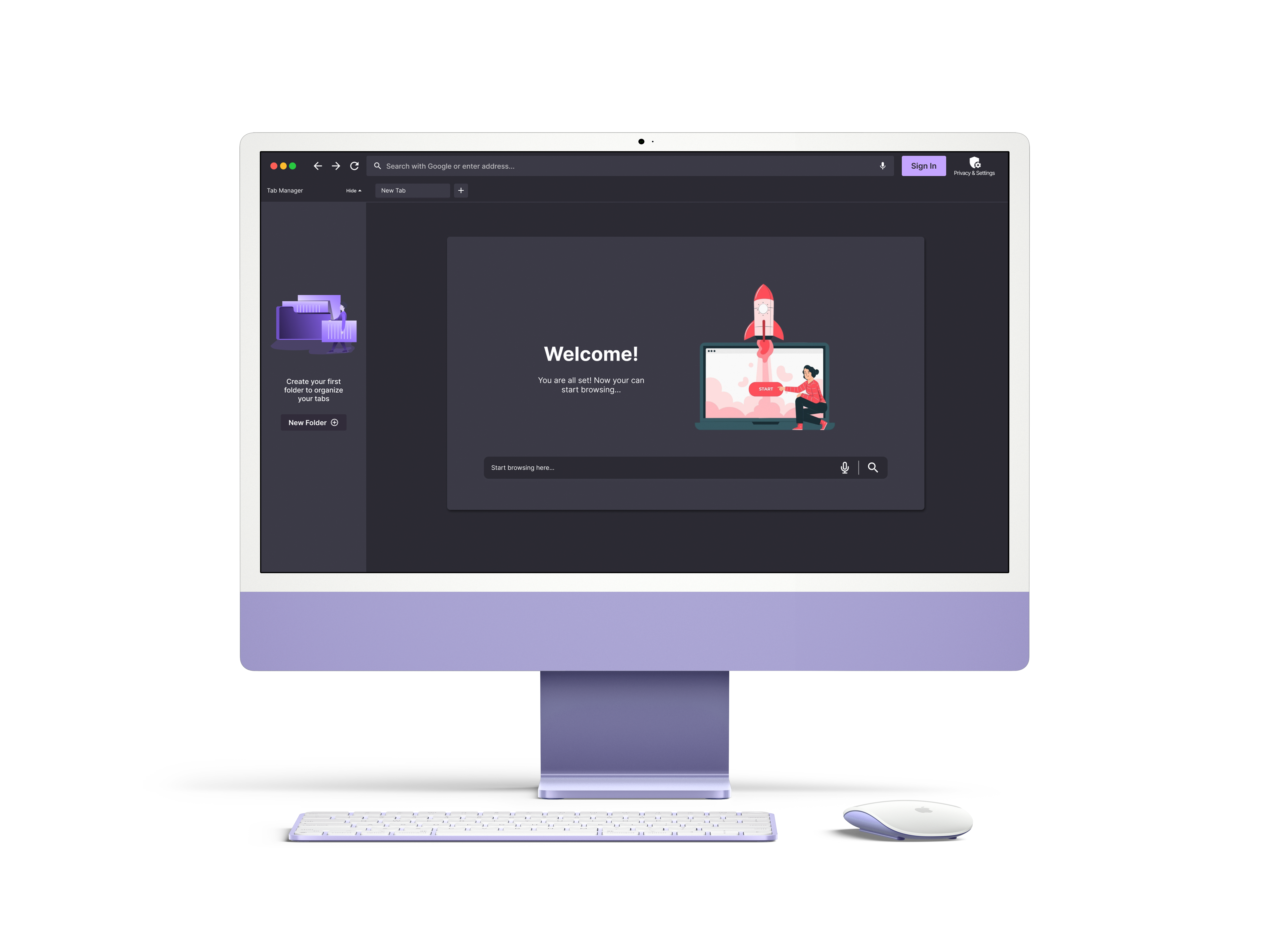
High-fi Prototype
In our second round of testing, we developed an initial high-fidelity prototype. Going into our second usability test, we had users complete 5 tasks within our interactive prototype. These tasks focused on our onboarding, flexible tabs, smart search and smart tools. We were able to conduct 3 tests.
Fig.5 High-fi Prototype
Key Findings and Refinements
User testing revealed strong support for organized tab management, with participants appreciating features like tab folders, side tab views, and the replacement of traditional bookmarks. However, many requested greater customization, such as unlimited categories, full-screen view, and automated sorting. Users responded positively to AI features like summaries and video conversion. However, some expressed distrust in AI-generated content and preferred traditional search results. They requested the ability to switch between views. Several users expressed pain points related to the design of the search cards and specifically related to the icons and the labels such as secure, more, and heading. Users also desired clear explanations and onboarding for features like the tab manager, AI tools and privacy settings.
Users had suggested improvements such as adding filters like relevancy, colour coding, and improving clarity around the purpose of the right sidebar. Refinements were made based on this feedback. The right sidebar was removed, and the AI features were incorporated into the left sidebar. Tutorial pop-ups were included, the initial onboarding screen was modified to display settings users care about most, and enhanced filtering options were included.
Final Prototype
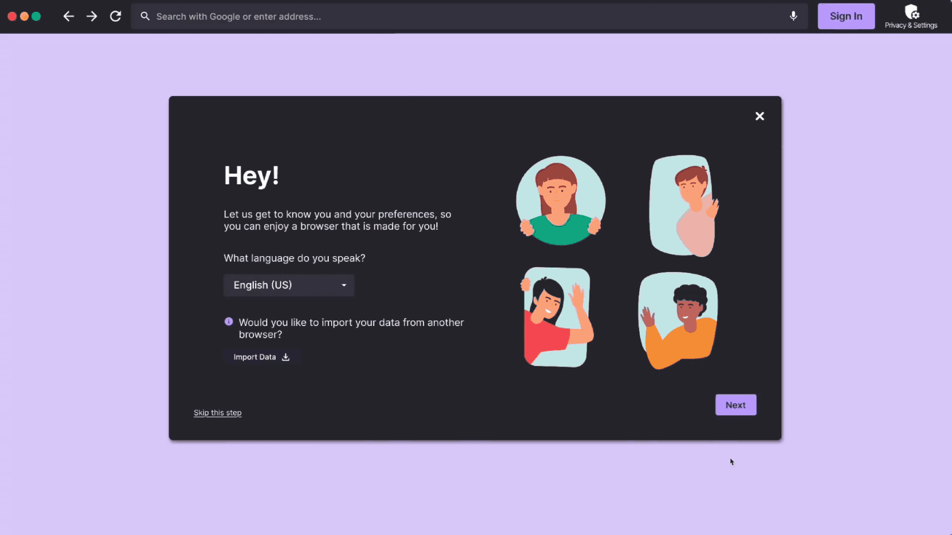
Upon launching the browser for the first time, users are guided through an onboarding setup designed to be quick, intuitive and user-friendly. During this phase, they can personalize their experience by selecting a theme, choosing a preferred language, and setting initial privacy preferences. Users are also recommended popular extensions. Once onboarding is complete, they are free to begin exploring. A customizable privacy dropdown can be found directly within the main navigation bar, while more settings are located within the dedicated Privacy and Settings page.
Fig.6 Onboarding and privacy flow
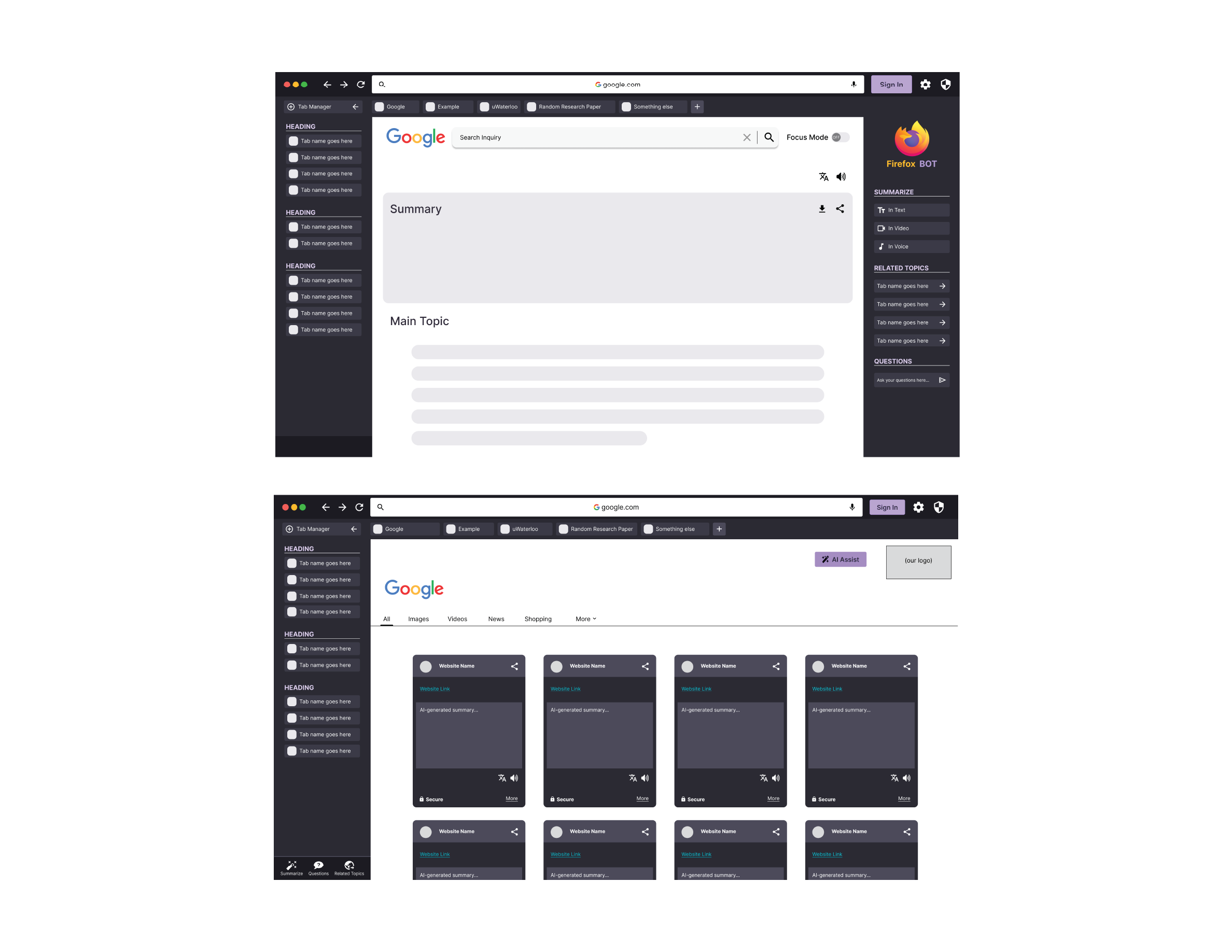
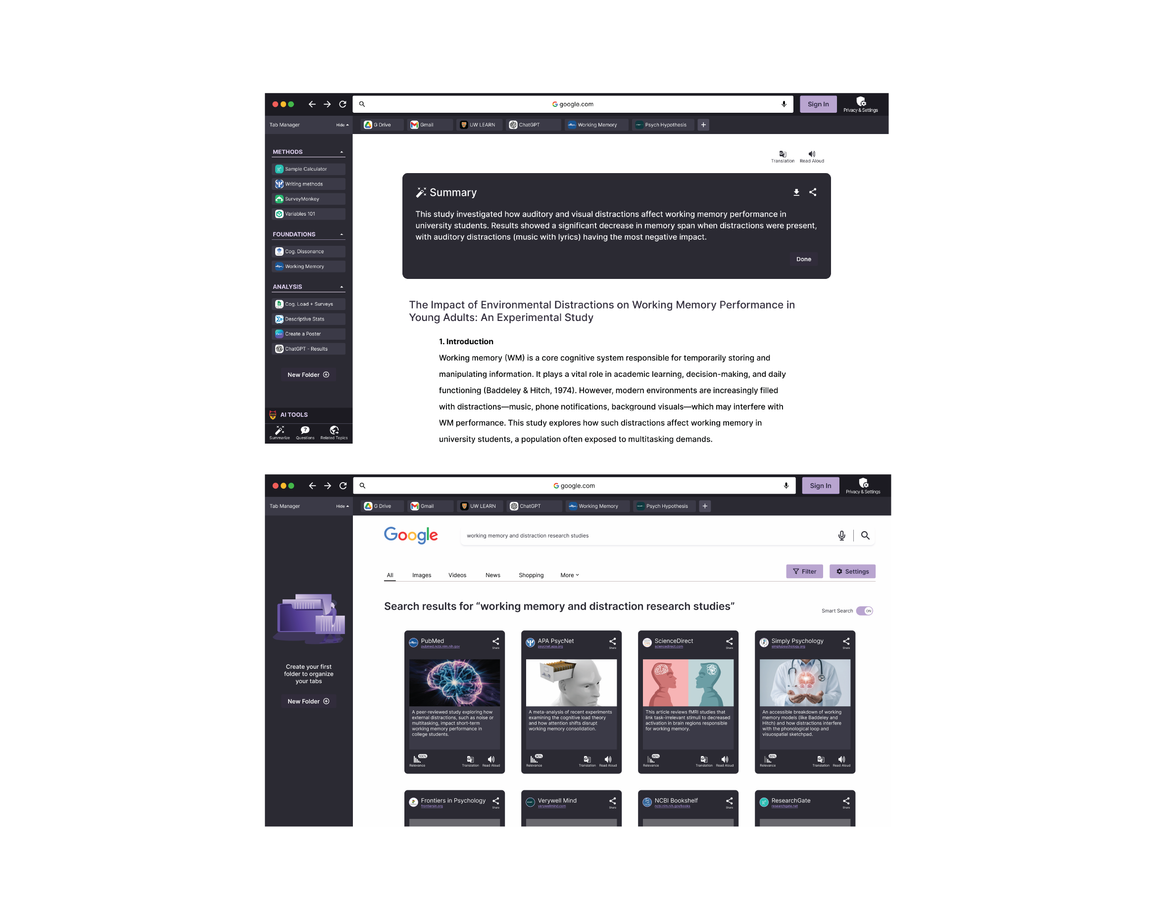
When users search, they can switch between 2 modes: smart search and regular search. Smart search will provide an initial image preview alongside an AI-generated summary to help users decide if a result is worth exploring. Once a result is selected, users can select an AI-generated summary to be developed. They can choose between text, audio or video formats for this tool. Users can also ask the AI bot questions or view related topics for further exploration. An initial onboarding tutorial will also be visible during this process.
Fig.7 Smart Search and AI tools flow
Our integrated tab manager offers a streamlined way to stay organized. This feature allows users to group tabs into custom folders, accessible from the collapsible sidebar. The tab manager is entirely customizable. Users can assign images, titles and colours to each folder. On first use, the browser provides an onboarding tutorial to guide the users through the organization process. To save a web page, users can drag it into the sidebar and assign it to a folder, keeping the information accessible without cluttering the tab bar.
Fig.8 Flexible tabs flow
Future Iterations
Some features that the client may be interested in pursuing at later stages of this project include a mobile experience, additional organization features for the tab manager such as sub-folders and folder grouping. We are also interested in exploring third party app integration and a continuity feature that will allow users to easily transition from desktop to mobile.
Reflection
As this project was a two week sprint many of the challenges faced during this project were a result of our time constraints. In our initial ideation faze we had many ideas that we were interested in exploring for this project. However, we had to narrow our scope to ensure this project was feasible to complete in that time frame.
Another key challenge we faced was the limitation of Figma, some of the initial ideas we had for how the flexible tabs would work were not feasible to prototype with Figma. As a result, we had to reimagine some of these features to ensure we could adaquately demonstrate them to our clients.
And finally the last challenge we faced was the limited sample size for our usability tests. We believe that with further testing we would be able to further improve the usability of this brower and the functionality of our new features.
Conclusion
Our information retrieval database platform allows users to find relevant and updated information on conservation topics. Through the platform, users can read various reports, review suggested content, learn more about authors, interact with our interactive map to discover local studies, watch tutorials on tools and approaches, rate, bookmark, or download content, connect with other practitioners through discussion forums to discuss relevant topics, make requests to updated information on the site, and publish some of their findings.